Design Systems
Building Scalable Component Libraries for Seamless User Experiences Across Organizations
My Work Evolving & Managing Design Systems
State Street
Cognitive Athletics
Fidelity
State Street Design System Evolution
How might we build and implement a new design system with existing legacy systems in a way that preserves functionality while enhancing consistency and user experience?
The Challenge
Specific Goals
Expand the component library, clarifying usage guidelines, and facilitating a smooth transition from legacy systems to increase adoption and ultimately improve client satisfaction.
Key Metrics
Success was measured by increased team utilization, improved product consistency, and demonstrable efficiency gains in the design and development process.
From Legacy to Launch: Orchestrating a Design System Revolution
This project focused on the comprehensive evolution of State Street's design system, addressing both legacy system challenges and the need for a robust, modern component library.
My role encompassed deep assessment of existing systems and componentry, strategic gap analysis, and meticulous tracking of work-in-progress to align with product modernization efforts. This involved not only direct contributions to the library's expansion but also oversight of team contributions, ensuring seamless handoff to development, and ultimately managing the entire design lifecycle from concept to deployment.
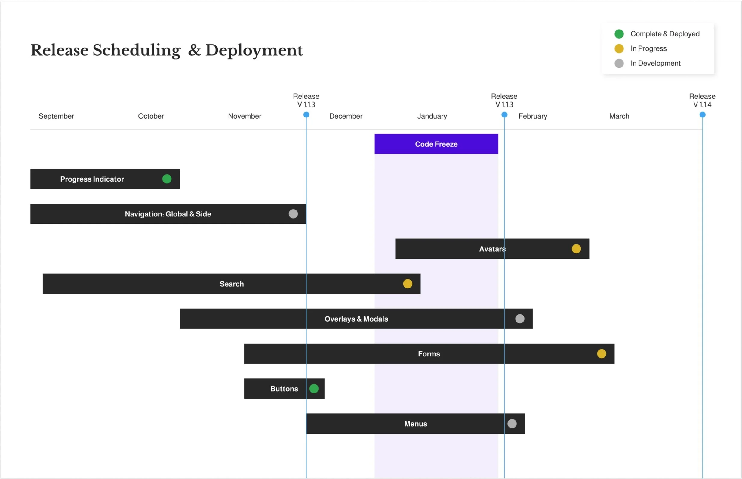
Planning & Deployment
Communication and teamwork were crucial to this project's success. We utilized shared, segmented trackers for cross-team collaboration, ensuring components were not only functional in design but also clearly prepped, handed off, and developed. Weekly check-ins with development teams, along with asynchronous testing and feedback, and pre-deployment QA sessions facilitated a smooth process. Post-deployment, we encouraged organization-wide feedback, fostering continuous improvement and expansion to address emerging use cases. This collaborative approach prioritized clarity, simplicity, and partnership throughout the entire design system lifecycle.
Behind the Scenes:
Designing for Optimal Functionality
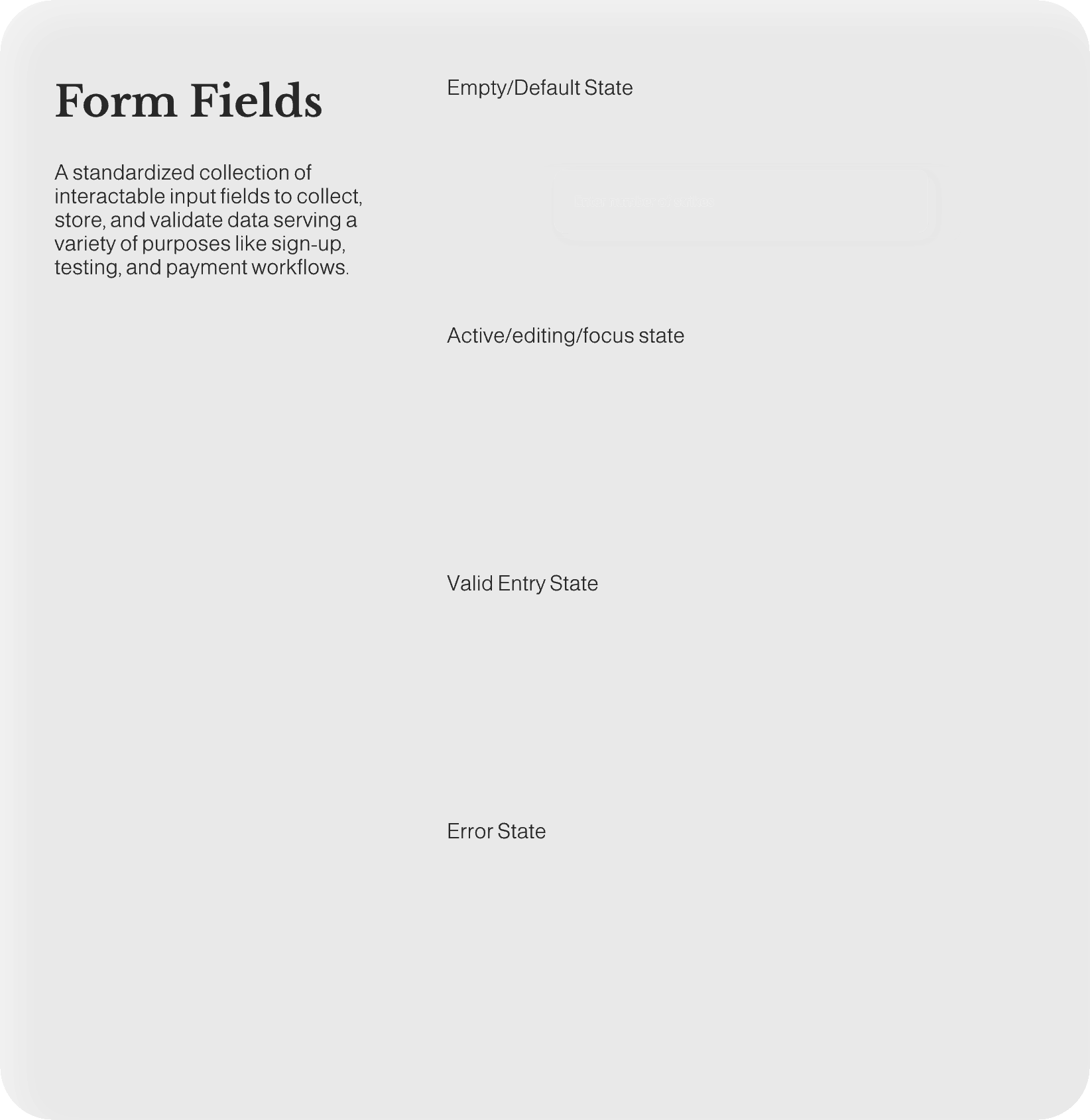
When it was time to design, my work went beyond aesthetics, focusing on rigorous testing with scenarios derived from insightful sessions with product partners and extensive research into industry best practices. This process, informed by leading design system specialists, resulted in beautifully crafted components and patterns designed for both visual appeal and clear communication. With deep critical assessment, these designs were future-proofed, considering scalability and feature additions as the library grew and user needs evolved. This forward-thinking approach ensured the design system could adapt to expanding business requirements and remain a valuable asset over time as user needs expanded into new use cases for increased functionality.

Responsive Modals
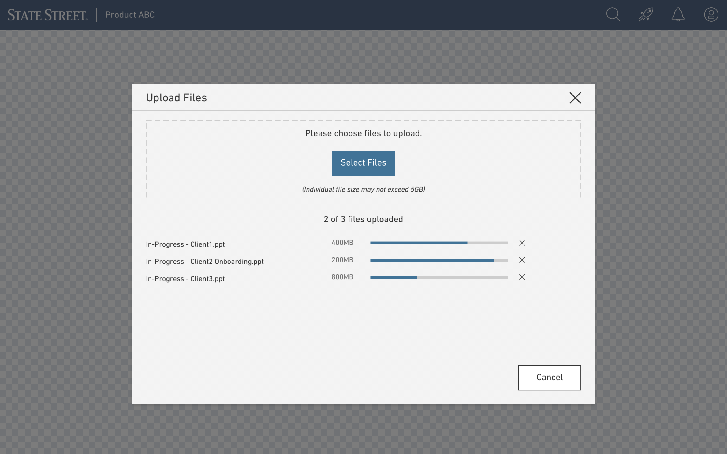
Responsive Uploads

Responsive Status Monitor

Responsive Progress Indicators
Webpage Designs

Results
The impact of this design system evolution was significant, modernizing applications for increased performance, efficiency, and client productivity. We translated conceptual initiatives into tangible results through technology enhancements and streamlined operations. This included co-creating and implementing our product design process across fourteen product initiatives, designing responsive components and web pages, and refining complex requirements into highly functional products. Beyond design, I championed the company's first UX team, advocating for its value, managing product engagements, and overseeing design resources. Ultimately, this work not only elevated the user experience but also established a foundation for future design system growth and scalability.
In just the first 12 months our work
35+
OPTIMIZED PRODUCTS & TEAM ENABLEMENTS
75+
CONSULTATIONS & PARTNERSHIPS
585+
EMAIL INQUIRES TO WORK TOGETHER
2 to 11
EXPANDED OUR SMALL TEAM TO A FULLY SCALED DESIGN TEAM
Including Visual Designers, Interaction Designers, Communication Strategists, Off-shore Teams in China and India, and Product Lead Interns
21
NEW COMPONENTS DEPLOYED
With an entirely new Design System website, and 4 new educational sections for guidance, principles, and usage. As well as an entirely updated color palette with all AA and AAA accessibility requirements met.
11
UX METHODOLIGES LEVERAGED IN OUR USER RESEARCH STUDIES
21
COMPONENTS TESTED FOR USER FEEDBACK AND ITERATIVE DEIGN IMPROVEMENTS
95+
HOURS OF USER TESTING CONDUCTED INTERNALLY AND EXTERNALLY ACROSS THE ORGANIZATION
Cognitive Athletics Design System Creation
How might we build a flexible, robust, and insightful design system that positions the brand as a tech-savvy leader in wellness and enables both coaches and athletes to easily consume rich layers of data across their digital platforms?
The Challenge
Specific Goals
Create a cohesive library that visually communicates trust, supports advanced feature sets paired with detailed data visualizations, and embodies innovation while ensuring ease of use across a wide variety of users.
Key Metrics
Success will be measured by an increase in user acquisition, a reduction in time-to-market for new features, and positive feedback regarding the clarity and intuitiveness of the new visual language.
Laying the Foundation: From Assessment to System Build
I initiated my design process by conducting a comprehensive audit of the current digital presence and the array of new feature requirements. This assessment went beyond simple documentation; I created a visual map of the existing app and web platform, transforming complex feature lists into an easily digestible overview. This map facilitated clear communication and alignment between myself and all my decision-making partners including product, business, and development.
Here I could document the present features to carry into the new experience as well as highlighted all new functional enhancements desired by the team. For each feature I could define the components required for their execution. Paired with extensive design system experience and my foundations in UX best practices I could build a full-scale library to serve as a future-proof foundation for Cognitive Athletics’ growth.
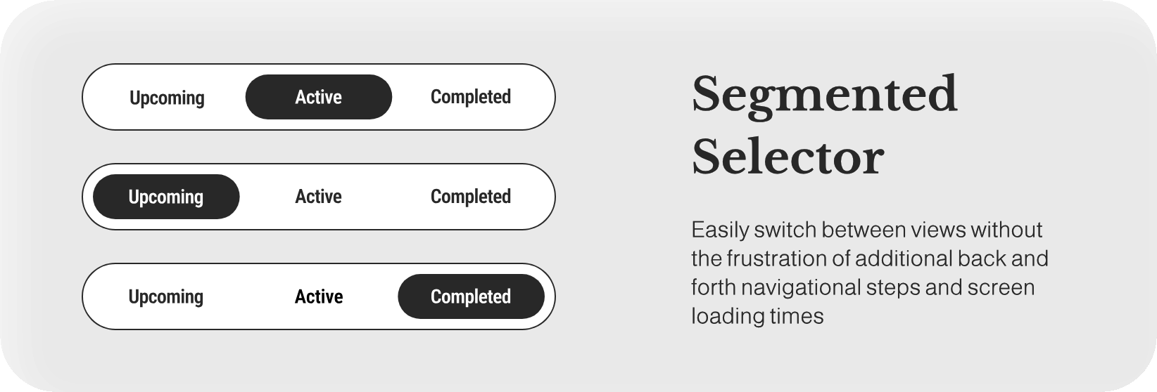
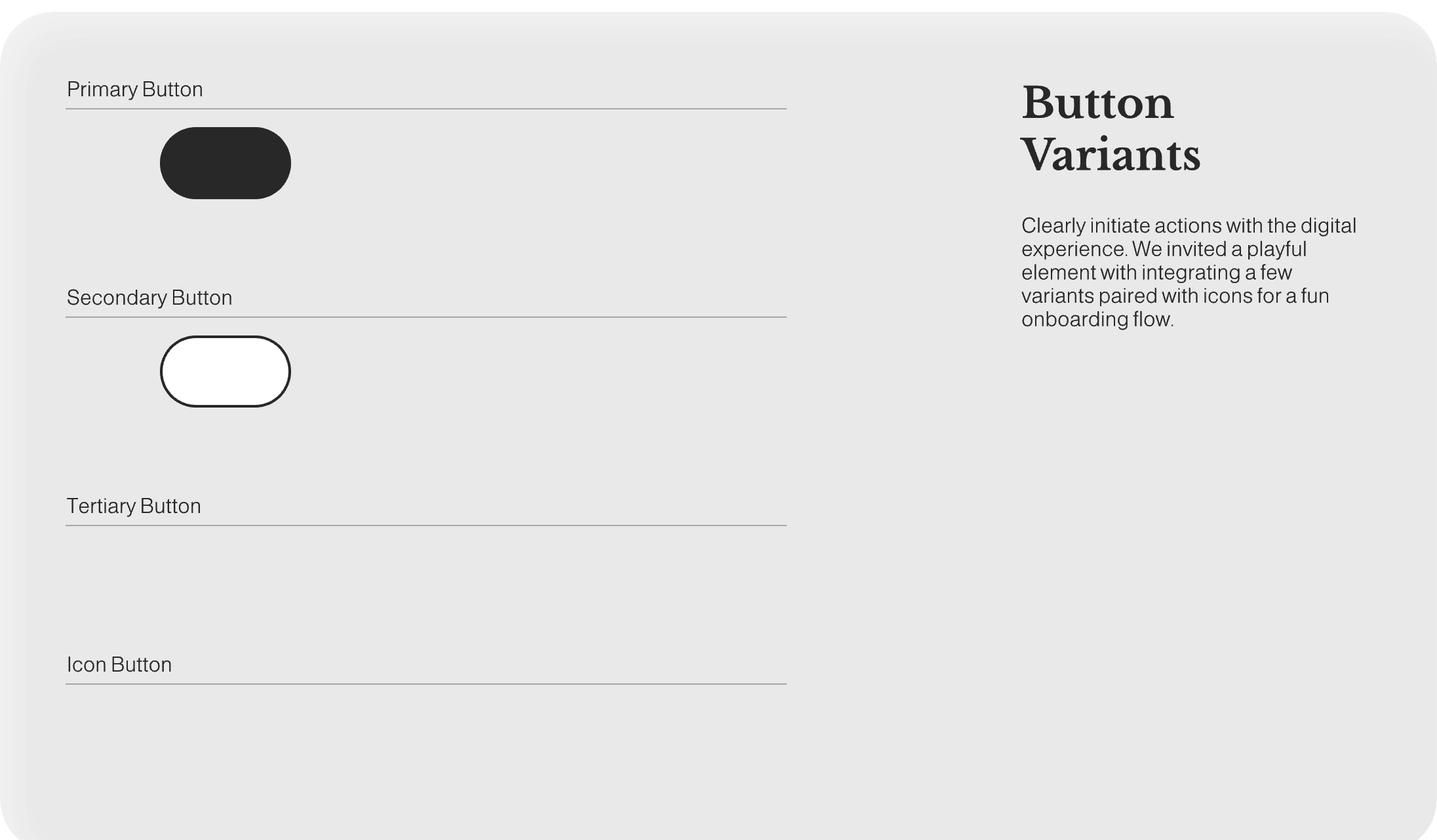
Building for Clarity & Consistency
With the strategic foundation in place, the core work shifted to the design, development, and comprehensive documentation of the asset library. My primary objective was to ensure that every element, from color palettes to complex component, was not just usable by me, but also by our development partners and any future designers.
This meticulous phase focused on translating component requirements into a functional, reliable library that serves as the single source of truth, detailing every asset’s purpose, utilization, and various interaction states.
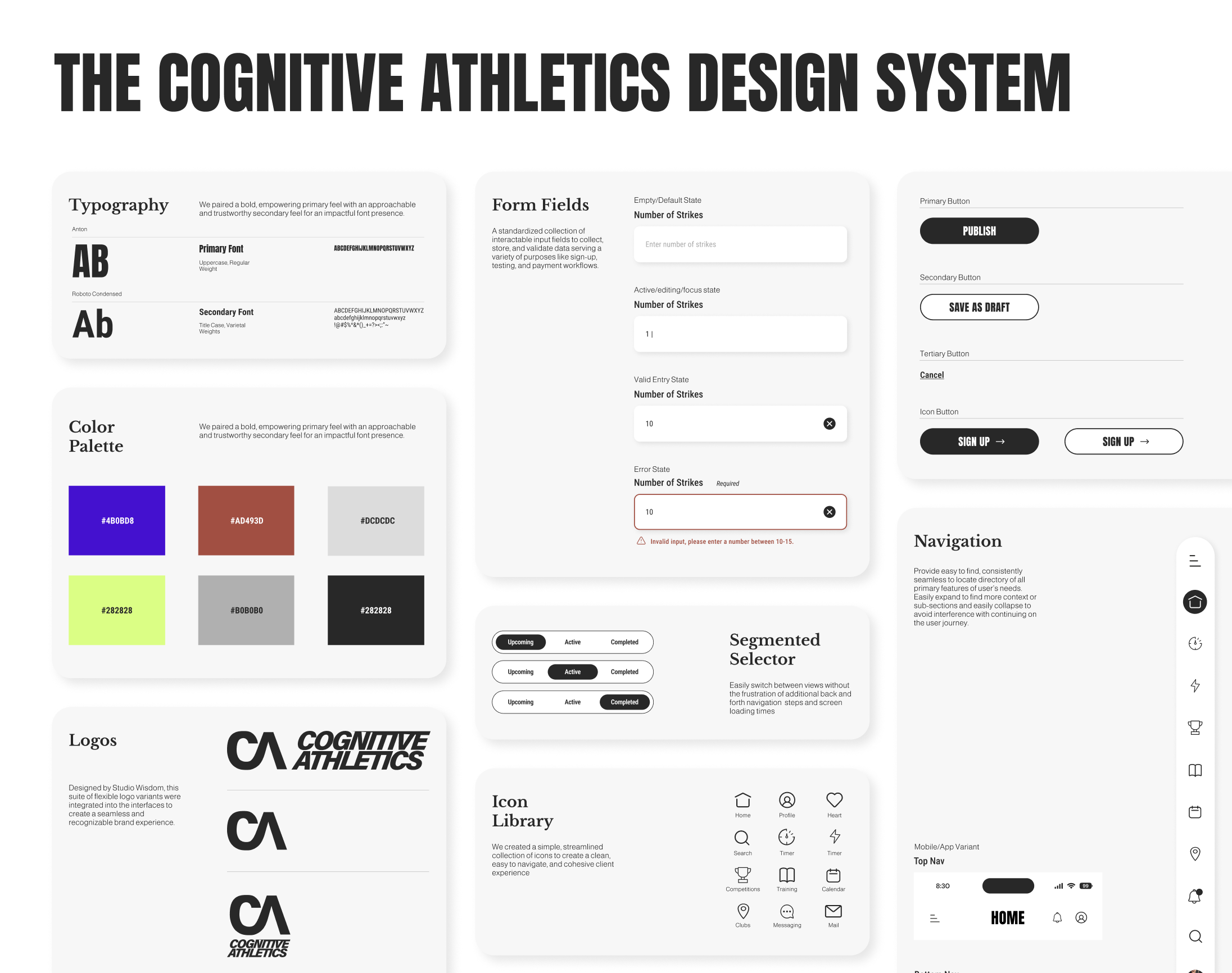
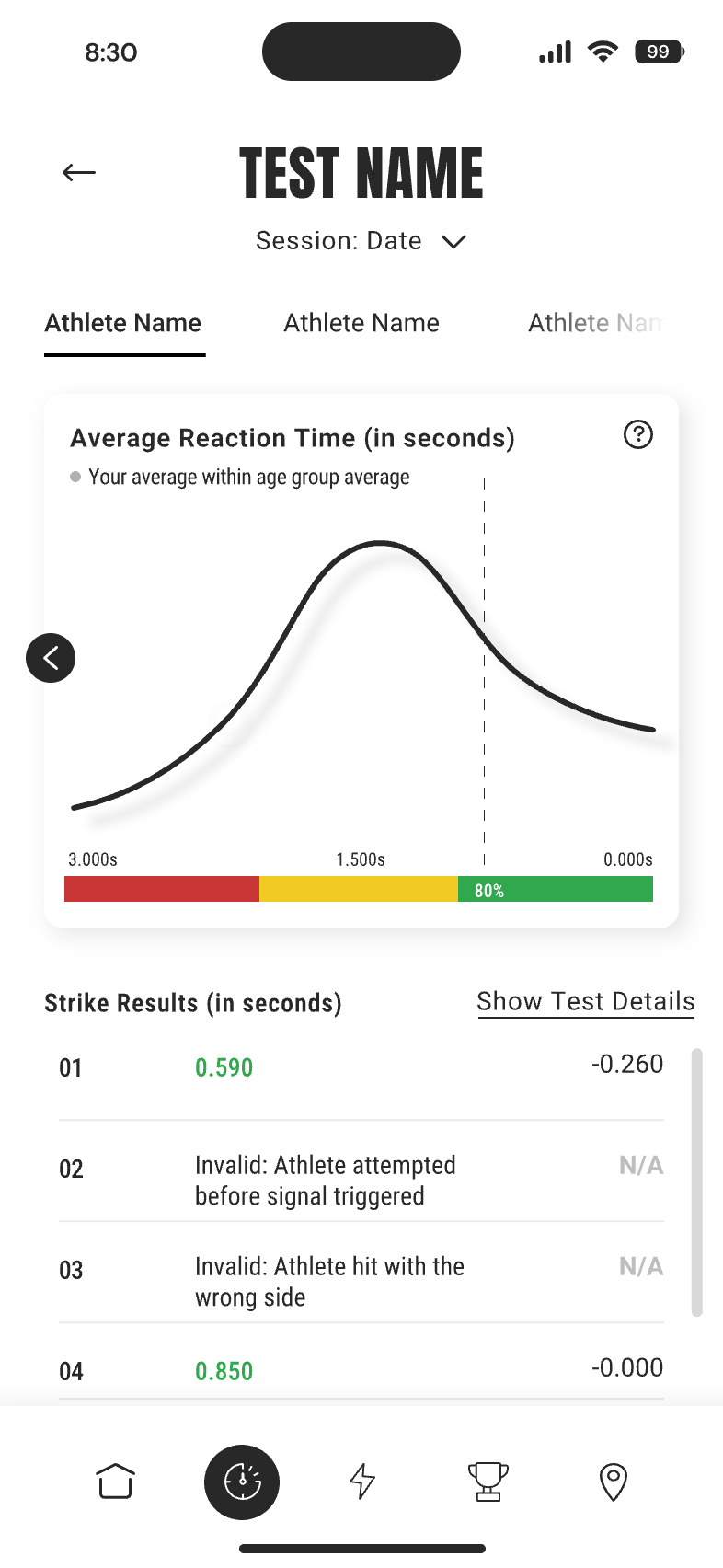
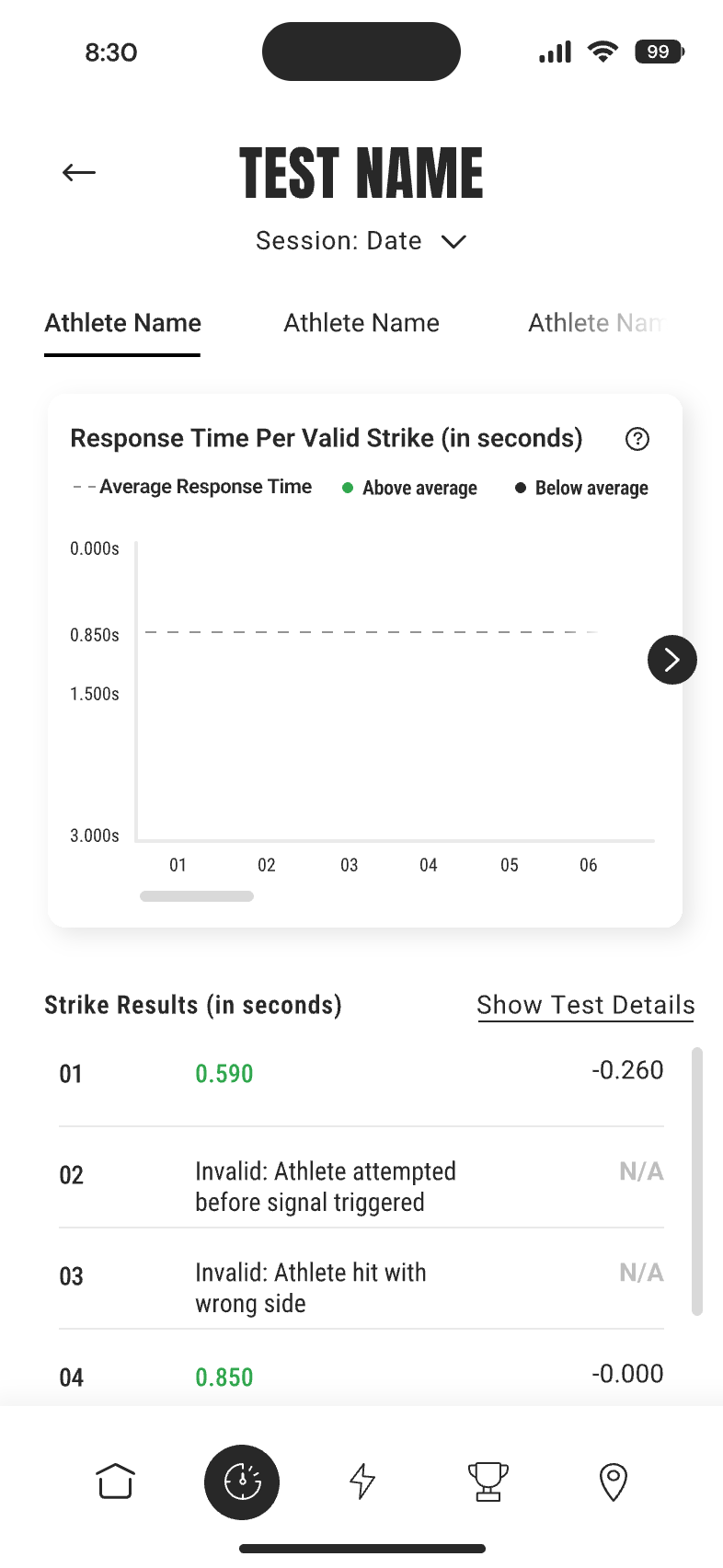
A core objective was ensuring seamless integration and adaptability, defining responsive adjustments for web and mobile counterparts to guarantee accessibility across all screen sizes. Crucially, the system's visual language was intentionally branded through a robust color strategy where variants, such as green for positive metrics and specific hues for warnings, were assigned clear, human-centered meanings. This ensures the design system supports all functional needs while embodying the brand's commitment to being bold, clear, and insightful.
The System in Action:
From Components to Cohesive Experience
After months of wireframing and pressure testing the components in real-life designing workflows things got real.
After 4 months of concentrated, focused, hard work I created a unified and intuitive digital experience built with an expansive library built for longevity. Take a look around at the new visual language enabling layers of complex functionality for Cognitive Athletics as it takes on the U.S. market. This work shows how every interaction, from browsing the learning library to analyzing dense performance metrics, was thoughtfully designed in an accessible, engaging, and consistent way for both the coach and athlete.
Interested in seeing more design system work?